3 Types of Logos: Which is right for you?

If you look around everywhere you go, you are gonna come across a logo, NO MATTER WHAT. They are associated lwith food, clothing, and even electronics. When someone asks about any kind of product that they are interested in buying, naturally we suggest our favorite brand. Now, remember, let's not get the term “brand” confused with the term “logo” because they are separate things. (click here to find out the difference between, Brand, Brand Identity, Branding ). A logo is basically an symbol to help us ONLY recognize a brand.
Overtime working with clients, I have learned what kind of logos most people lean towards. Some prefer a logo that is only an image and others like the simple idea of a logo with just straight text (like myself 😌🤗). In some instances, there are some cases where people get the 2-for-1 combo and get both. What I am trying to get around to is, there are so many different types of logos to choose from. You have monograms, wordmarks, brandmark, and even abstract logos. Head pounding?? Don't worry it’ll all make sense later on.
With that being said, I want to know how is YOUR brand being recognized? More importantly, What type of logo are you? Can't decide? No worries, that's where I come in and help you out 😉. So let's break it down to more technical and professional terms. All of the terms that I listed above fall under 3 MAIN CATEGORY of logos.
(please enjoy the fact that I encoproated all my favorite shopping clothing campanys -- signed your favorite shopaholic 🙂)
First Up :
Typographical - straight and to the point!
Basically its any logo with only text, Like my favorite shopping addictions PLT (Pretty Little Things), Forever 21, and Shein 🦄✨.
There are two types of typographical logos:
Monogram - simply the initials or first letter of a logo
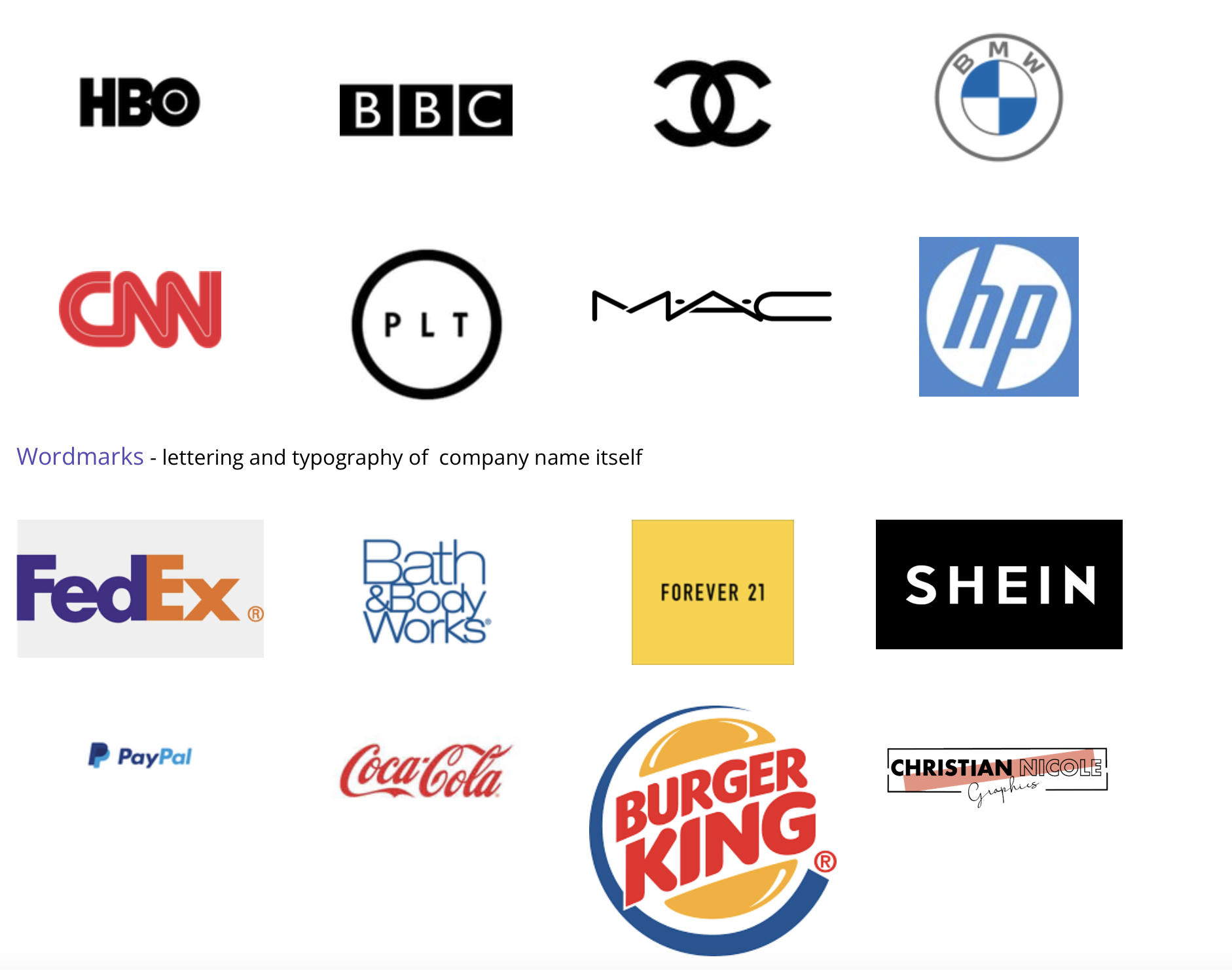
***secret hack -- there is an arrow between the E and X of the FedEx Logo 🤯
Next :
Iconic - Images speak louder than words (see what I did there lol)
The name is exactly what it is, an icon, pictorial, or imagery logo.
These two types are pretty interesting:
Brandmark - an image that represents the name of the company without actually having the company name in it.


Logos are an extension of who we are as a person and as a company as a whole. So I ask you again, which type of logo best suits you? Keep in mind when choosing one to make sure you take your time with it and really figure out what best suits you. Think of the color scheme, what message you are trying to portray, and most importantly how will you grab people's attention. (take a look at some tips on how to start here.) Either way, whichever one is your preference I know it’ll be outstanding (especially if it's designed by me 😊).
I hope you found this blog helpful!
Enjoy your Holiday Weekend!